 Good managers must not only be able to understand the conceptual underpinnings of cost behavior, but they must also be able to apply those concepts to real world data that do not always behave in the expected manner. Cost data are impacted by complex interactions. Consider the costs of operating a vehicle. Conceptually, fuel usage is a variable cost that is driven by miles. But, the efficiency of fuel usage can fluctuate based on highway miles versus city miles. Beyond that, tires wear faster at higher speeds, brakes suffer more from city driving, and so forth. Vehicle insurance is seen as a fixed cost; but portions are required (liability coverage) and some portions are not (collision coverage). Furthermore, a wreck or ticket can cause the cost of coverage to rise. The point is that assessing the actual character of cost behavior can be more daunting than might be suspected. Nevertheless, management must understand cost behavior, and this sometimes takes a bit of forensic accounting work. Begin by considering the case of “mixed costs.”
Mixed Costs
Many costs contain both variable and fixed components. These costs are called mixed or semi-variable. For example, cell phone agreements can provide for a monthly fee plus usage charges for excess minutes, text messages, and so forth. With a mixed cost, there is some fixed amount plus a variable component tied to an activity. Mixed costs are harder to evaluate, because they change in response to fluctuations in volume. But, the fixed cost element means the overall change is not directly proportional to the change in activity.
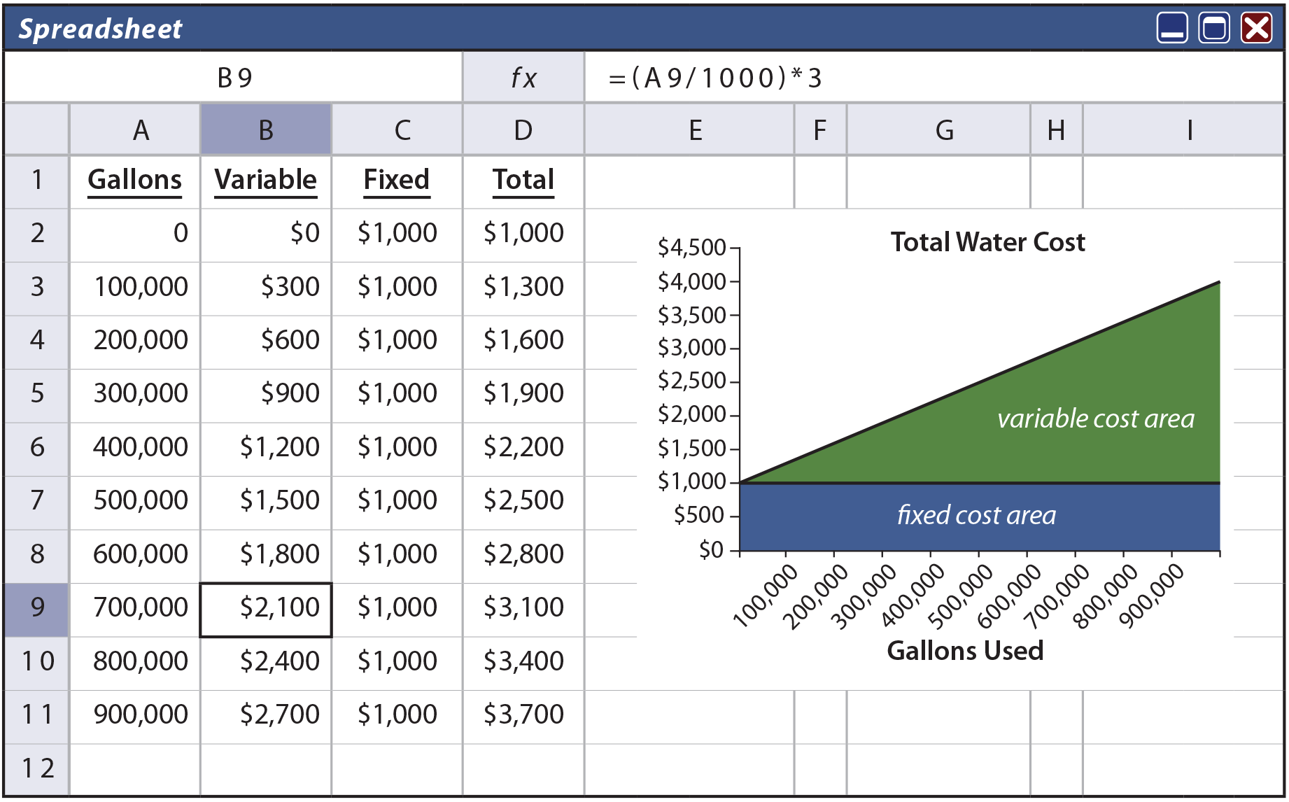
To illustrate, assume that Butler’s Car Wash has a contract for its water supply that provides for a flat monthly meter charge of $1,000, plus $3 per thousand gallons of usage. Look closely at column B in the following spreadsheet and notice that the “variable” portion of the water cost is $3 per thousand gallons. For example, spreadsheet cell B9 is $2,100 (700 thousand gallons at $3 per thousand). In addition, column C shows that the “fixed” cost is $1,000, regardless of the gallons used. The total in column D is the summation of columns B and C. The graph shows the total cost behavior at various levels of water consumption.
High-Low Method
What if one did not know the “formula” by which the water bill was calculated? Instead, the only information is a few past bills. Could one estimate how much the bill should be for a particular level of usage? This type of problem is frequently encountered, as many expenses contain both fixed and variable components. One approach to sorting out mixed costs is the high-low method. It is perhaps the simplest technique for separating a mixed cost into fixed and variable portions. However, beware that it can return an imprecise answer if the data set under analysis has a rogue data point.
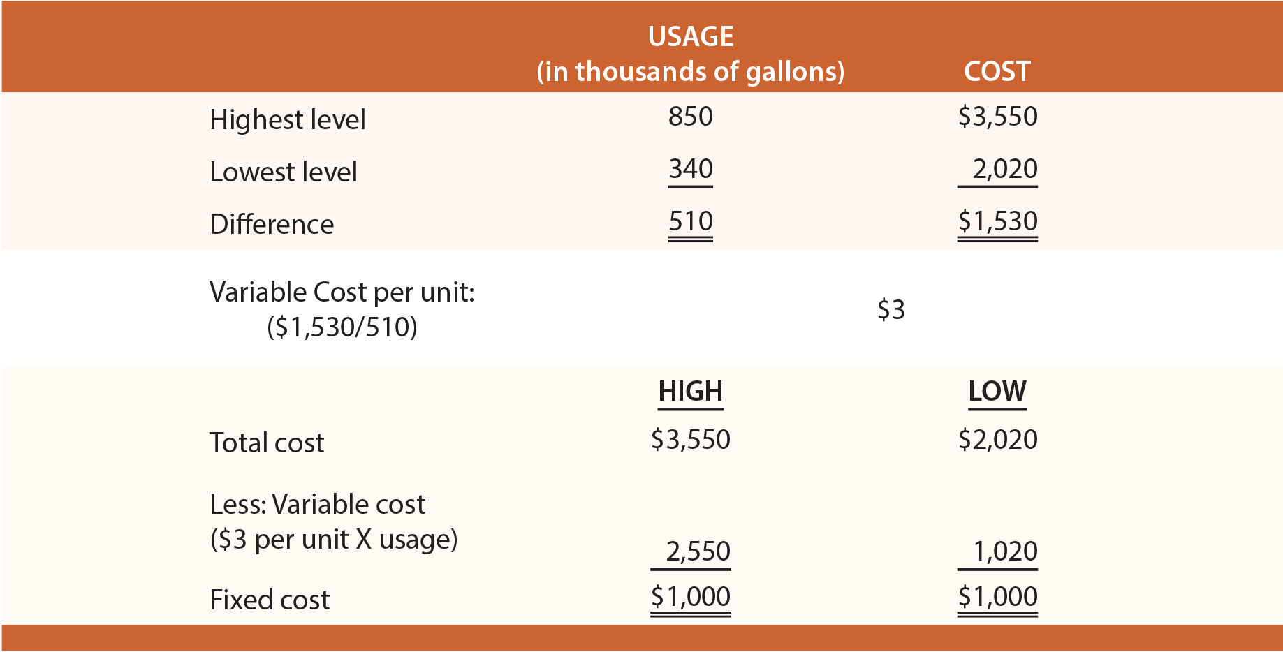
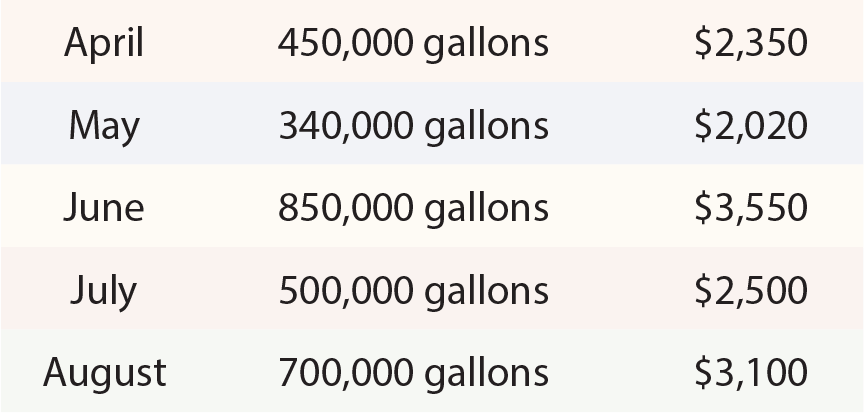 Information from Butler’s actual water bills is shown at left. Butler is curious to know how much the September water bill will be if 650,000 gallons are used. With the high-low technique, the highest and lowest levels of activity are identified for a period of time. The highest water bill is $3,550, and the lowest is $2,020. The difference in cost between the highest and lowest level of activity represents the variable cost ($3,550 – $2,020 = $1,530) associated with the change in activity (850,000 gallons on the high end and 340,000 gallons on the low end yields a 510,000 gallon difference). The cost difference is divided by the activity difference to determine the variable cost for each additional unit of activity ($1,530/510 thousand gallons = $3 per thousand). The fixed cost can be calculated by subtracting variable cost (per-unit variable cost multiplied by the activity level) from total cost.
The table below reveals the application of the high-low method.
Method Of Least Squares
As cautioned, the high-low method can be quite misleading. The reason is that cost data are rarely as linear as presented in the preceding illustration, and inferences are based on only two observations (either of which could be a statistical anomaly or “outlier”). For most cases, a more precise analysis tool should be used.
Regression analysis or the method of least squares is ideally suited to cost behavior analysis. This method appears to be imposingly complex, but it is not nearly so complex as it seems. Start by considering the objective of this calculation.
The goal of least squares is to define a line so that it fits through a set of points on a graph, where the cumulative sum of the squared distances between the points and the line is minimized (hence, the name “least squares”).
Simply, if a railroad company was laying out a straight train track to serve a lot of cities, least squares would define a straight-line route amongst all of the cities, so that the cumulative distances (squared) from each city to the track is minimized.
Thinking deeper, begin with the characterization of a line. A straight line is a continuous extent of length passing through two points and can be defined on a graph by its intercept with the vertical (Y) axis and its slope along the horizontal (X) axis.
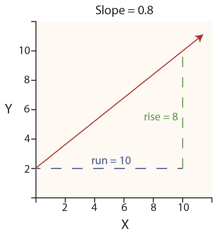 In the diagram at right, observe the red line starting at the Y axis (at the “intercept” value of 2). This line then rises consistently upward to the right as it moves out along the X axis. The rate of rise is called the slope of the line. The slope is 0.8, reflecting that the line is “rising” 8 units on the Y axis for every 10 units of “run” along the X axis. Therefore, the slope is sometimes called rise over run.
In general, a straight line can be defined by this formula:
Y = a + bX
where:
a = the intercept on the Y axis
b = the slope of the line
X = the position on the X axis
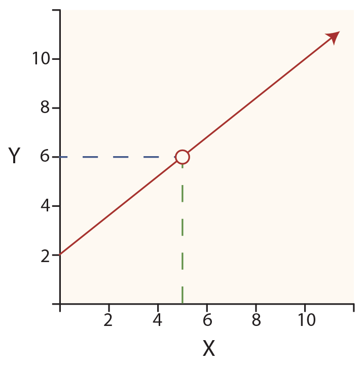
For the drawing, the formula would be:
Y = 2 + 0.8X
If one wished to know the value of Y, when X is 5 (see the red circle on the line), one would perform the following calculation:
Y = 2 + (0.8 * 5) = 6
Next, move on to fitting a line through a set of points. The following spreadsheet shows an example of monthly unit production and the associated cost (sorted from low to high). These data are also plotted on the graph. Through the middle of the data points is drawn a line, with the formula of:
Y = $138,533 + $10.34X
This formula suggests that fixed costs are $138,533, and variable costs are $10.34 per unit. This means it would cost about $1,276,000 to produce about 110,000 units ($138,533 + ($10.34 * 110,000)).
How was the formula derived? One approach would be to “eyeball the points” and draw a line through them. One would then estimate the slope of the line and the Y intercept. This approach is known as the scattergraph method, but it would not be precise. A more accurate approach, and the one used to derive the preceding formula, would be the least squares technique.
With least squares, the vertical distance between each point and resulting line (e.g., as illustrated in the drawing that follows by an arrow at the $1,500,000 point) is squared, and all of the squared values are summed. Importantly, the defined line is the one that minimizes the summed squared values! This line is deemed to be the best fit line, hopefully giving the clearest indication of the fixed portion (the intercept) and the variable portion (the slope) of the observed data.
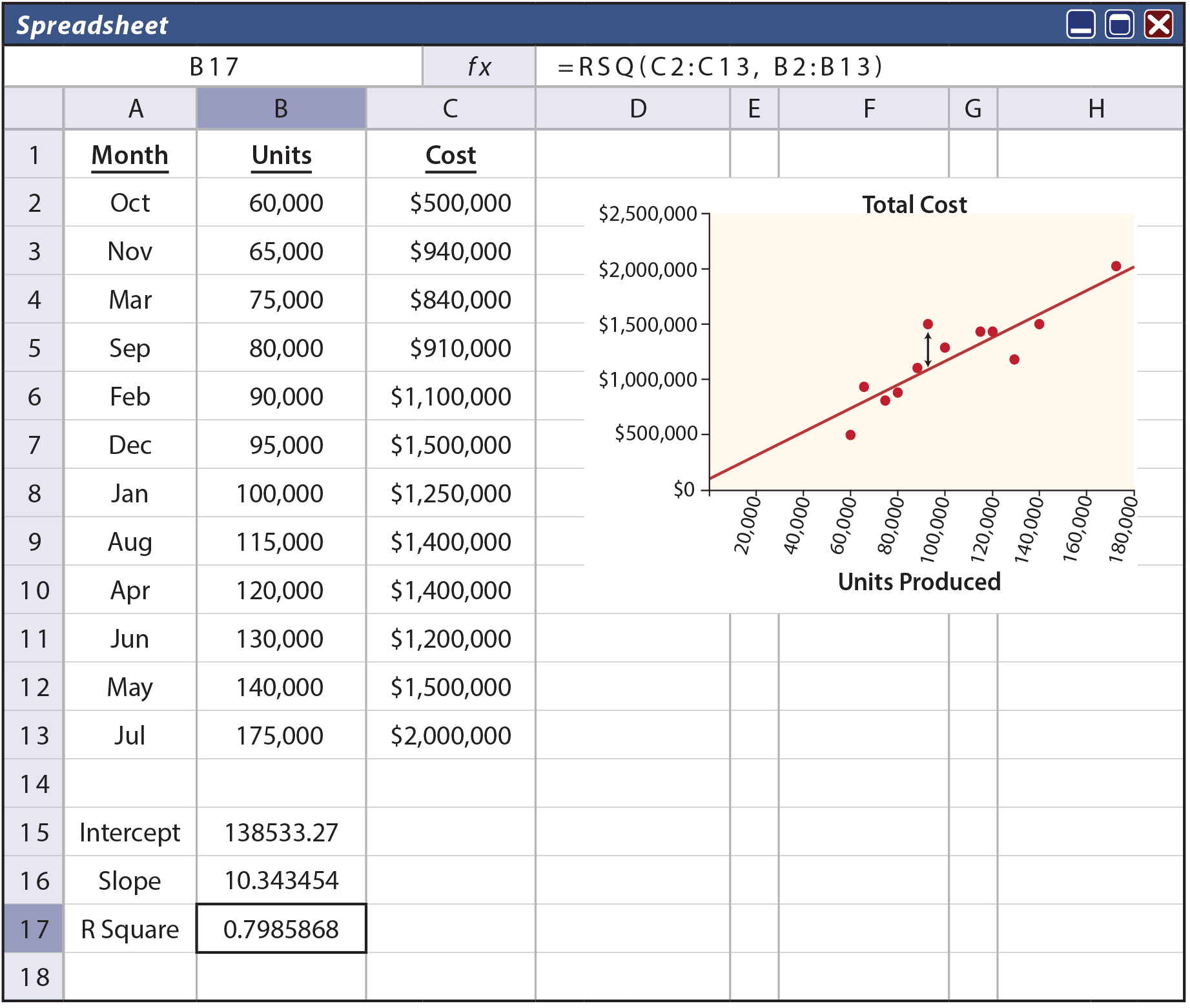
One can always fit a line to data, but how reliable or accurate is that resulting line? The R-Square value is a statistical calculation that characterizes how well a particular line fits a set of data. For the illustration, note (in cell B17) an R2 of .798; meaning that almost 80% of the variation in cost can be explained by volume fluctuations. As a general rule, the closer R2 is to 1.00 the better; as this would represent a perfect fit where every point fell exactly on the resulting line.
How does one go about finding the line that results in a minimization of the cumulative squared distances from the points to the line? One way is to utilize built-in tools in spreadsheet programs, as illustrated above. Notice that the formula for cell B17 (as noted at the top of spreadsheet) contains the function RSQ(C2:C13,B2:B13). This tells the spreadsheet to calculate the R2 value for the data in the indicated ranges. Likewise, cell B16 is based on the function SLOPE(C2:C13,B2:B13). Cell B15 is INTERCEPT(C2:C13,B2:B13). Most spreadsheets provide intuitive pop-up windows with prompts for setting up these statistical functions.
| Did you learn? |
|---|
| Carefully describe the nature of a mixed (semivariable cost). |
| Use a scattergraph, method of least squares, and the high-low method to sort the fixed/variable components of a mixed cost. |
| Be able to apply the mechanics of the high-low method. |